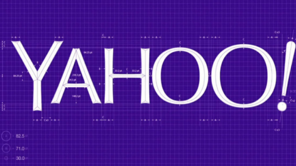
Marissa Mayer may be “geeking out” over Yahoo’s new logo, but early reactions suggest she is in the minority.
More than three quarters of Internet users prefer Yahoo’s old logo to the new logo, according to a survey of more than 400 online respondents Thursday from Survata, a market research group. Likewise, polling app Polar found that people prefer Yahoo’s old logo to the new logo 2-1, based on more than 1,000 responses.

Credit:
That’s certainly not the initial response that a brand wants when updating its logo, especially when that brand has spent the previous 30 days trying to call attention to the upcoming logo by teasing one new design every single day. But according to branding experts, the negative reaction was probably inevitable.
“It’s increasingly typical for there to be a loud and often negative reaction and even more so for anyone who doesn’t have a good reputation,” Martin Bishop, director of brand strategy for Landor Associates, told Mashable, noting that Yahoo isn’t necessarily perceived as “cutting edge” anymore. “In that situation, almost anything they would have done would have been criticized.”
Even so, Bishop argues that Yahoo’s new logo represents a “missed opportunity” for the brand to really demonstrate a “strong new identity.”
“This is a little like a fresh coat of paint. It signifies that there’s life inside the building, but it doesn’t do more than that,” he says. “This is a company that requires more than a fresh coat.”
In her blog post announcing the new logo, Mayer explained that she and her team wanted a fresh look, but one that stuck to the brand’s history: “We knew we wanted a logo that reflected Yahoo – whimsical, yet sophisticated. Modern and fresh, with a nod to our history. Having a human touch, personal. Proud.”
Each of the logos teased during the 30-day campaign adhered to this basic premise, keeping the company’s trademark purple color and exclamation point. Yet, at least one of these logos might have been better received than the actual new logo: Survata and Polar both surveyed and found that the logo teased on Day 10 was the favorite, with Polar’s data showing 69% of viewers preferred it to the original logo.

Credit:
Either way, Yahoo has accomplished at least one thing with its new logo: people are talking about it. Crimson Hexagon, a Twitter sentiment analysis firm, found that there were more than 28,000 tweets about the new logo in just the first 12 hours after it was revealed:

Credit:
The good and the bad news for Yahoo, according to Bishop, is that all the negative and positive chatter about the logo will likely be short-lived. Ultimately, he doesn’t expect this to change the perception of the brand for better or worse.
Source: here
